The Marketing Analytics Brain, Part 1: Getting the Data to Trust Itself
M.N. · 7 min read · 06/05/2026
Part 1 of 4 — Part 2: Smarter Editorial Decisions with Data · Part 3: Paid and Organic Intelligence in One View · Part 4: AI Search, Human Judgment, and What This Tool Is Actually For
Most marketing teams work with data spread across half a dozen disconnected tools. Search Console in one tab, Google Analytics in another, a spreadsheet for editorial planning, a separate dashboard for paid spend. The information exists. It just lives in different places, speaks different formats, and requires a person to manually stitch it together every week.
The result is predictable: a weekly ritual of copy-pasting numbers, hand-normalizing URLs, and recalculating comparisons that should already exist. Any question from the team means rebuilding part of the sheet. By the time you have the answer, the conversation has moved on.
This is the first in a four-part series describing an analytics system built to fix that. Each article covers a distinct layer of the tool. This one covers the foundation: getting all the data to speak the same language, knowing when a traffic change actually means something, and using the structure already inside your content to turn search clicks into geographic data.
One Schema, One Language
Before any analysis can happen, the data has to use the same identifiers. This sounds obvious, but it is where most analytics setups break down quietly.
Google Analytics stores a page visit as a path: /houston-tx-lawn-care. Search Console stores the same page as a full URL: https://www.domain.com/houston-tx-lawn-care?utm_source=google. Google Ads stores the keyword that sent traffic to it. The CMS stores the page content metadata under a slug. None of these match by default.
The fix is to normalize everything to a single canonical form (path only, query string stripped) before any join or comparison happens. That normalization gets written once and applied everywhere. When two views measure the same pages using two slightly different URL patterns, the numbers disagree, analysts lose trust in the data, and people go back to checking things manually in separate tabs.
The same principle applies to segment definitions. Rather than defining "show me all lawn care pages" separately in each view, the definition lives in one place and every view imports it. When a new service type gets added, one update propagates everywhere. It is a small thing that keeps a multi-view system from drifting into inconsistency over time.
Knowing What Changed and Why
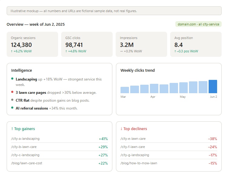
The Overview and Drop Alerts views both exist to answer the same question: is something wrong, and if so, is it specific to a few pages or happening everywhere?
Every metric in the Overview is shown in two modes. Week-over-week catches recent changes fast. Year-over-year provides the seasonality context that week-over-week cannot, because for a business built around outdoor services, spring will always look strong relative to winter regardless of whether anything actually improved. Both comparisons anchor to complete Monday-to-Sunday weeks so that "last week" means the same thing to everyone on the team regardless of what day they look at it.
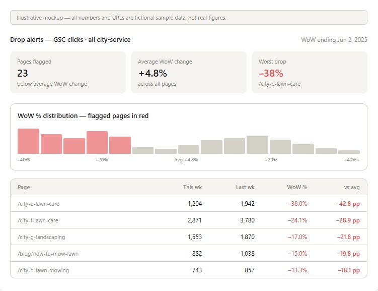
The Drop Alerts view takes this further. Rather than simply showing which pages declined, it measures each page's change relative to the average change across all pages that week. That distinction matters in practice: if a page dropped 20% but the whole site dropped 15%, that page is only slightly underperforming the field and is probably caught in something systemic. If a page dropped 20% while the rest of the site was flat, that is a real signal worth investigating. Without that normalisation, a team ends up chasing drops that are just the tide going out, and missing the ones that are actually page-specific problems.
Geography as a Dimension, Not a Filter
Most SEO tools treat geography as something you filter down to: show me traffic from Texas. The more useful framing is that geography is a structural property already encoded in the content itself.
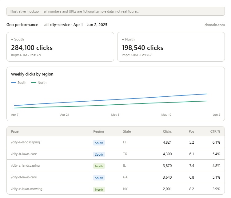
City-service pages are geographic objects. A page for lawn care in Houston has the city and the service type in the URL. If you can map every page URL to a market, and every market to a region, then search clicks automatically become geographic data without any IP inference, geographic API, or additional tracking layer.
The join is straightforward: page slug to city record to market to region. The analytical payoff is substantial. You can ask whether the North is recovering faster than the South after a weather event, compare spring performance across regions on the same time axis, or spot which state is pulling an aggregate number down.
The comparison overlay takes this further by shifting a historical period's dates forward so it aligns with the current period's start date. Instead of looking at two separate charts, you watch two lines on the same axis. Divergences between the periods become immediately visible in a way that side-by-side tables never quite achieve.
Part 2 covers the editorial and content layer: how to score a large blog library for refresh priority, find quick wins in CTR gaps, identify near-miss rankings worth pushing, and run title and meta description tests across groups of pages rather than one at a time.